
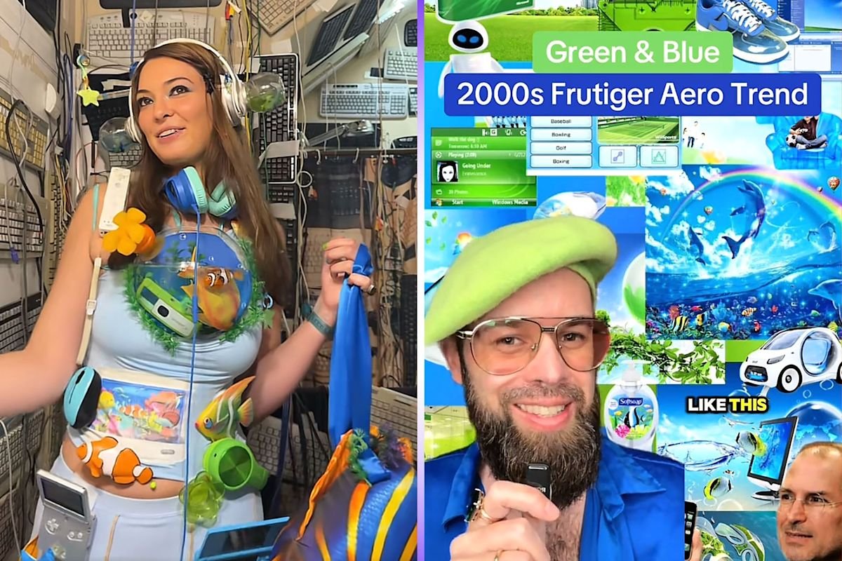
Gen Z Reclaims Frutiger Aero Aesthetic From Gray Tech
Younger generations are rejecting the current trend of sterile, gray-and-white hardware in favor of Frutiger Aero. This vibrant design language, which dominated the tech landscape between 2004 and 2013, is making a comeback as users seek to inject personality back into their devices. By embracing the glossy bubbles, lush nature-inspired imagery, and saturated blues once common on Windows XP or early iPod minis, Gen Z is actively choosing optimism over the homogenized minimalism that currently defines modern computing.
Why Tech Companies Abandoned Frutiger Aero
According to website designer Jeff Romero, the industry underwent a massive visual shift around 2012. Both Apple and Microsoft began stripping away the razzle-dazzle of their user interfaces to prioritize faster load times and flatter, functional design. While this move made the web more efficient, it also drained the joy from our screens. Harald Austad, an artist who has tracked the rise of Frutiger Aero, notes that original designs were meant to bridge the gap between humans and machines. These natural colors acted as a buffer, making high-tech hardware feel approachable rather than cold or intimidating.
The Cultural Impact of Vintage Hardware
The movement toward Frutiger Aero is not just about visual preference; it is a search for the sense of wonder that defined the dawn of the internet. Content creators like Lanie and Myra Magdalen have helped push Frutiger Aero into the spotlight by crafting outfits and shower routines that mimic the glossy, aquatic, and nature-heavy motifs of the early 2000s. Whether it is through collecting transparent gaming consoles or customizing digital spaces, users are finding comfort in this specific era of tech optimism. For many, the modern era lacks the playful, modular charm that once made gadgets feel like personal treasures.
What This Means for Future Device Design
The industry is currently facing a crossroads where efficiency and user experience often collide with the desire for emotional engagement. As users grow tired of the same gray-scale aesthetic, designers may need to reconsider how they approach color and texture. While we are unlikely to see a return to the clunky, bubble-shaped hardware of the past, the influence of Frutiger Aero suggests that there is a massive appetite for hardware that feels less like a tool and more like an experience. If tech companies want to capture the attention of a younger, nostalgia-driven market, they might need to look back to the 2000s for inspiration.
- Key Elements of the Trend: Saturated blues, glossy textures, nature-inspired backgrounds, and whimsical, bubbly UI shapes.
- Peak Era: 2004 to 2013, covering the height of the iPod mini and Windows XP.
- Consumer Shift: A move away from modern gray-and-white homogenization toward high-energy, friendly design.
For full official background and direct documentation, read the source coverage on Tech.yahoo.com Reporting.