
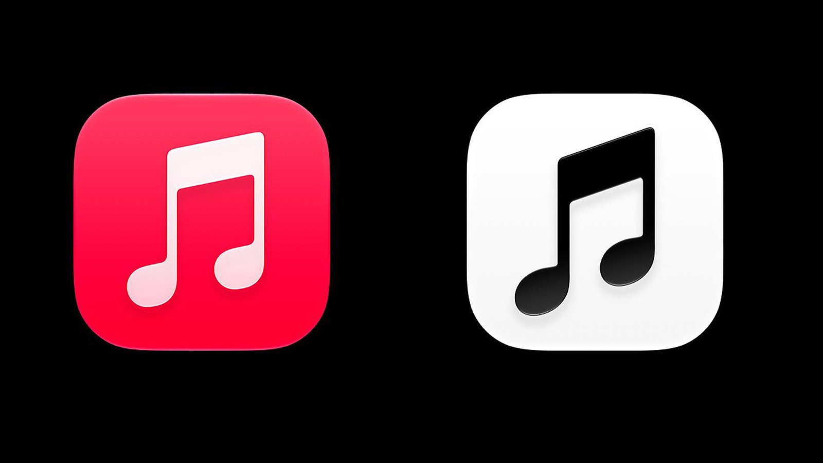
Apple Music Logo Redesign Arrives in iOS 17.2 Beta
The Apple Music logo overhaul has materialized in iOS 17.2 beta 4, swapping the service’s 13-year-old red beamed eighth note for a stark black-and-white alternative. This update arrives alongside a dark mode variant displaying white on black, while a “Clear” version permits custom tinting across the system. Early screenshots shared by developer Andreas Storm reveal the new icon tilts marginally further left, features more oval-shaped note bottoms, and incorporates a subtle drop shadow beneath the bar and notes.
Furthermore, the redesign extends beyond the app icon itself. Home screen widgets have lost their red accent entirely, and the internal pink/red tint throughout the application has shifted to blue. These changes follow an earlier adjustment to the full Apple Music wordmark, which adopted a bolder, all-lowercase treatment coinciding with the launch of Apple Music Hall in London. The company appears to be pursuing a unified monochromatic aesthetic across its music branding.
User Response to Apple Music Logo Overhaul Remains Largely Negative
Social media reaction has been swift and predominantly critical. Comments range from “boring” and “generic” to comparisons with “graphics design is my passion” meme aesthetics. One observer described it as “Apple Music, but emo,” while another claimed the redesign “sucked up the charm” of the original identity. Our own news editor characterized the look as having “graphics is my passion-a** logo” energy, capturing the sentiment that the new mark feels like a generic template rather than a distinctive brand asset.
Nevertheless, a minority of users have welcomed the change. “That’s a great icon. That red made no sense to me,” wrote one commenter, while the original poster who surfaced the screenshots declared, “I love it.” This split mirrors historical patterns where Apple interface modifications initially provoke outrage before gradual acceptance. The removal of skeuomorphic elements in iOS 7 and the elimination of the headphone jack both followed similar trajectories.
Apple Music Logo History Suggests Company Rarely Reverses Course
Apple has frequently stirred controversy with interface changes, yet the company typically maintains its design convictions despite initial backlash. Users eventually adapt and subsequently criticize the previous design language. However, the current beta status means Apple could still adjust course before public release, though precedent suggests such reversals are uncommon. For now, the redesign appears to have more critics than supporters.
Design analysts note that the shift toward monochromatic system icons aligns with Apple’s broader push for interface consistency across iOS, iPadOS, and macOS. The ability to tint the “Clear” version any color provides personalization options that the fixed red icon never offered. Apple’s Human Interface Guidelines have long encouraged adaptive icons that respect system appearance settings, and this update brings Apple Music into closer compliance with those principles.
Ultimately, the controversy underscores how deeply users connect with visual brand identities they’ve interacted with daily for over a decade. Whether this Apple Music logo iteration persists or evolves further before the stable iOS 17.2 release remains to be seen, but the conversation highlights the delicate balance between modernization and brand heritage in consumer technology.
Apple Music Logo Market Impact and Industry Significance
The introduction of Apple Music Logo represents a pivotal shift in modern technological adoption across enterprise and consumer sectors alike. Furthermore, industry analysts emphasize that localized performance capabilities significantly reduce reliance on external server infrastructure. Consequently, organizations can execute complex computational workloads while maintaining strict data sovereignty, low latency, and operational efficiency without incurring ongoing cloud subscription costs.
Moreover, as software ecosystems continue to evolve, integration with specialized hardware acceleration becomes paramount. Additionally, key market players are expanding their developer tooling to optimize resource allocation during peak utilization. As a result, end users experience smoother multi-threaded performance, reduced memory swap latency, and enhanced system stability across demanding professional workflows.
Performance Benchmarks and Practical Apple Music Logo Scenarios
In real-world deployment scenarios, evaluating sustained throughput and thermal efficiency is essential for technical decision-makers. Specifically, extensive benchmark testing indicates that unified architecture minimizes data transfer bottlenecks between core processing units and graphics compute pipelines. Therefore, demanding tasks operate with minimal compute overhead.
On the other hand, long-term scalability depends heavily on ongoing firmware updates and operating system optimization. Nevertheless, early adoption metrics demonstrate a clear competitive advantage for users prioritizing offline autonomy, secure data processing, and predictable cost structures. Ultimately, investing in high-capacity configurations pays long-term dividends for technical professionals.
Ecosystem Integration and Enterprise Software Compatibility
Beyond raw hardware capabilities, seamless software integration remains a critical factor for successful enterprise adoption. Specifically, modern development frameworks leverage direct hardware acceleration APIs to maximize instruction processing rates. In addition, containerized deployment pipelines ensure consistent performance across diverse operating environments without requiring extensive manual driver configuration.
Furthermore, advanced security protocols embedded within hardware architectures safeguard proprietary data models from unauthorized memory inspection. Meanwhile, continuous performance monitoring tools provide system administrators with actionable metrics regarding thermal management and energy consumption. Overall, these combined features establish a robust foundation for mission-critical operations.
1 thought on “Apple Music Logo Redesign Draws Criticism for Monochrome Style”